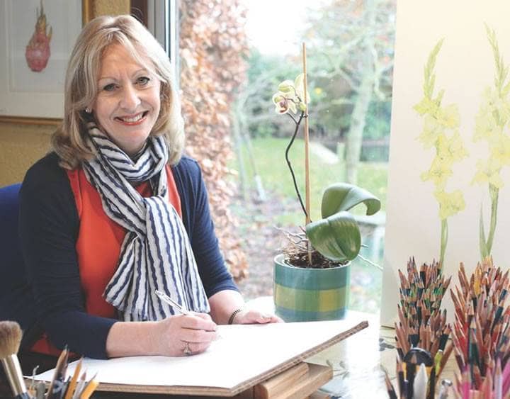
We would love to introduce you to Janie Pirie – A floral designer in her own right, Janie Pirie SBA specialises in floral and botanical art using coloured pencils. Her meticulously drawn and striking compositions have immensely accurate detail together with great depth and a rich intensity of colour.
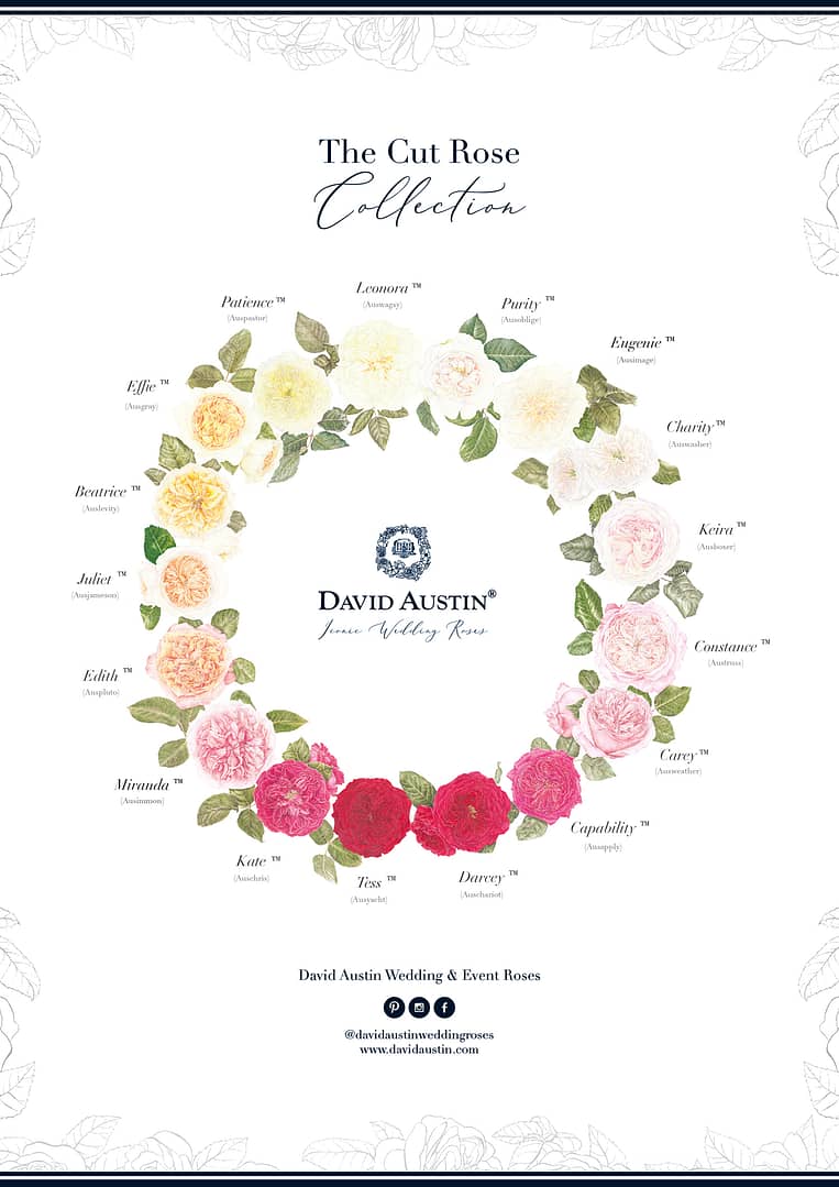
We commissioned Janie to draw an illustration of our cut rose collection by way of a botanical piece of art. The brief was to capture each bloom as close to real life as possible and maintain their individual characteristics.
Read below to see how Janie achieved this for us and how you can receive a free copy of this illustration.
How did you go about starting the rose illustration?
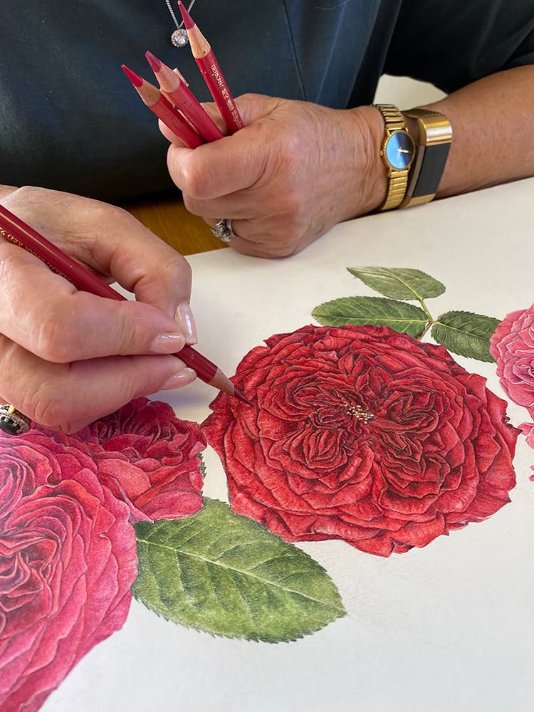
Creating this piece was always going to be a challenge because I needed to capture each rose at it’s ‘perfect’ best. The first thing to do was to get a good balance of colour moving around the ring, so I cut one of each rose and popped it into a small square of oasis. I then arranged them in a circle on my greenhouse floor until I was happy with the gradations of colour. Once approved I started drawing. The roses were sent to me in small batches so I had to wait until they were nicely opened. Needless to say, the drawings took some time because of the complexity of the petal formations. I drew them all on cartridge paper first, as there was a lot of erasing taking place! Once I was happy with one, I started on the next. I also drew (separately) several buds of each, together with leaves.
What was the next step?
When all drawings were complete, I traced them, and then cut out the tracings. I needed an extra large piece of HP (hot pressed) paper to work on, so had to buy a sheet of hardboard and cut it to 1m square to take the paper. The tracings were placed on the paper in the order we had agreed upon, and then I started adding buds and leaves until I was happy with the balance.
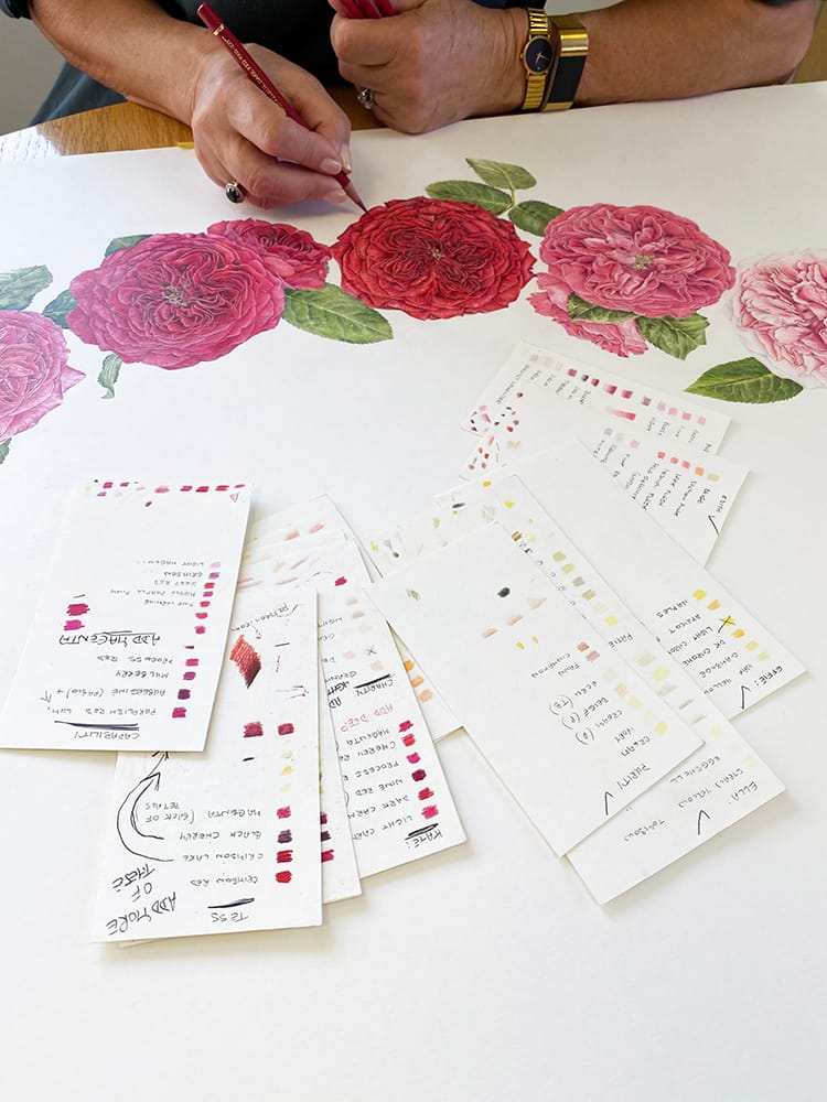
Then it was on to the colouring. Every bloom was on my desk for a while so I could match up exact colours and I made colour swatches for each one. The joy of this was the perfume in my studio. I started at the top and worked my way down the left-hand side until I got to Miranda. Then I worked down the right-hand side until I reached Carey. From there I worked across the bottom from left to right to complete all the darker pink and red blooms. This was so that I didn’t have any problems with deep colours smudging onto the white paper.
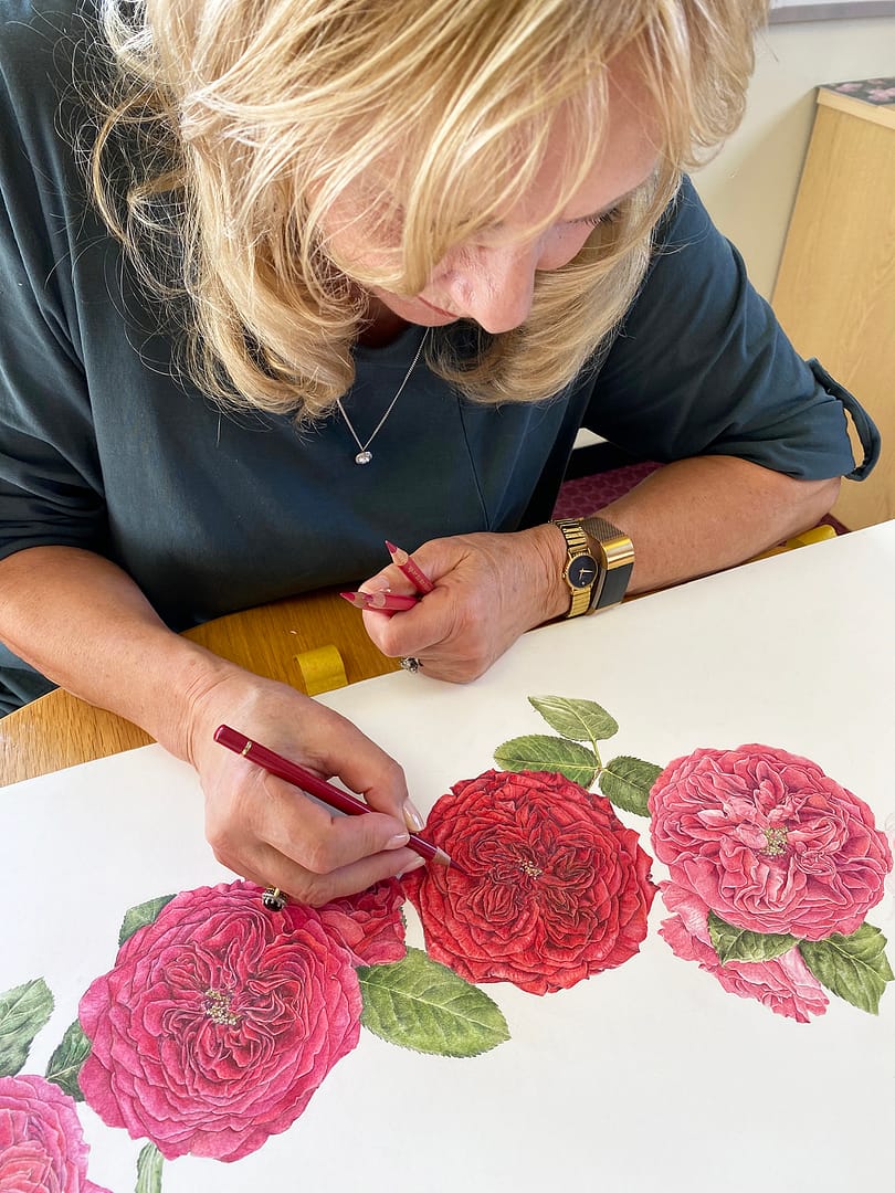
The first thing to do with any rose, but especially these multi-petalled ones, is to colour in the shadows as this helps to give form to the flower. It also makes it much easier to follow. My pencil points were kept as sharp as needles at all times, so I could get pigment into all the fibres of the paper surface. This also helps to build up rich areas of colour. Some roses took as long as 60 hours to complete. This was particularly so in the case of Darcey and Tess, because I had to work in many layers to create the velvety red of their petals.
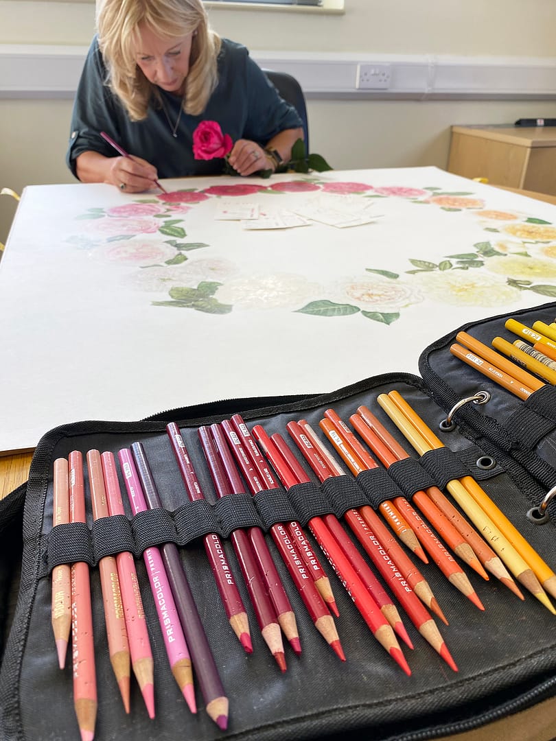
Because the paper was so large, I couldn’t always work the right way up, so having it on the hardboard made it easier to turn, a little at a time. Even transporting it to Albrighton was a logistical nightmare, but it got there unscathed on two occasions (for approval) and then down to Berkshire for scanning. I can honestly say, though, that it was an absolute pleasure to work on and I was thrilled with the end result.
Would you like a free copy of this floral poster?
If you would like to receive a copy of this beautiful illustration depicting our complete portfolio of cut rose varieties please email us directly at cu******@************co.uk providing your contact name and full postal address.
